Showing posts with label Study Task. Show all posts

OUGD401 - Study Task 4

-Modernist Design-

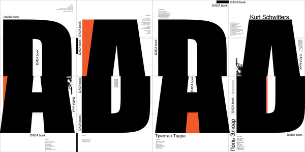
 -Dada Book - ME U WE-

This book designed by Russian Design Agence "ME U WE" is a visual representation of Dadaism - An avant garde sub movement of Modernism, as a reaction to World War 1. 

Carl Jung once said "its too idiotic to be schizophrenic" as a response to Dadaism, which is an obvious feature of the layout in this book. However, the book clearly has it's Moderisnist features: the layout of the type, the use of Grotesque and simple shapes. 


----------------------------------------------------------------------------------------------

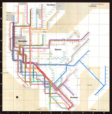
-New York Underground Poster (1972) - Massimo Vignelli-

Possibly the most iconic and definitely the most functional piece of Modernist design ever produced.  During the film Helvetica, Vignelli mentions hows this was made "50 % visual, 50 % verbal". To me this map couldn't be any simpler. Not only do the colour codes and structure use of type make it easy to read, but the geography of New York is also made easy to understand. 


However, being the obsessive Modernist Vignelli is, he thinks he could make it even more functional, by turning expressing the water as black instead of beige!


----------------------------------------------------------------------------------------------


-Neue Grafik - Carlo Vivarelli-


Vignelli describes Modernism as "never a fad", which is obvious here.  Vivarelli's design is timeless. It could have been produced over half a century ago, or yesterday, there is no obvious features that render the design dated. 


It is also highly funtional. The text is divided simply into paragraphs in each language, in the same order as the titles: German, English then French. 


----------------------------------------------------------------------------------------------


-Bridging The Gap - Ross Gunter-


A highly functional poster design. The use of yellow and black has scientifically been proven to be the most visible combination of colour, so here the text couldn't be any more crisp. Despite a huge gap in time, both this piece and the previous look like they could have been produced at the same time. 


----------------------------------------------------------------------------------------------


-Adidas Originals Branding - Bibliotheque Design-


This set of work was meant to coincide with the 2004 Athens Olympics. It is clear that the agency wanted to emphasise the "Originals", aka the history of the brand, which is why they chose to create something Modernist. 


Modernist features include the sans serif type, as well as no use of pointless information or slogans (like Nike often have their slogan "Just Do it"). Only the most basic of information has been shown. 


-Post - Modern Design-

-1984 Olympic Poster - Sussman-


I guess this image could be a good comparison with the contrasting Modernist image from above. The rejection of Modernism is obvious here by many features: the layered use of different media, clashing colour schemes and imagery. In my opinion, it encapsulates the history of the Games, but unfortunately lacks the discipline of the Games in its' style if design. 


----------------------------------------------------------------------------------------------

-RayGun Magazine Page - David Carson-

This "editorial" couldn't  be much more of a rejection to Modernism. The most obvious feature of Post Modernism is the use of WingDings as type, which really is sticking two fingers up to Vignelli. The article has absolutely no function, and only communicates a name, and even that has been obstructed. Carson mentions in the film Helvetica "accidents can be good", but here I think the accident has been used as a statement, and is not a huge leap in Graphic Design, be it Post Modern or not. 


----------------------------------------------------------------------------------------------

-Headcase - Album Artwork And Poster-

Headcase are a local Thrash / Hardcore band from near where I live. Their music is loud, aggressive and messy. It is clear that they want to replicate the DIY approach in the promotion of them in this poster, amongst other bands of a similar genre. 

The poster has a "can't be bothered" Punk approach to it, shown by the use of lined paper and hand written type. The image has just been cut up and stuck on, replicating the work of Reid and Garrett in the late 70's. There is absolutely no structure, and the choice of image is entirely random. 

I do not think these pieces were purposely Post Modern, as they were not produced by trained designers. However, it is still clear that the designers had an overal aesthetic which they had considered, and I think if they knew what Modernism was, they would have chosen to avoid it. 


This album artwork for their debut Ep "Grime and Punishment" is messy and entirely emotive. There are no clean lines, and certain no use of Grotesk type. 


----------------------------------------------------------------------------------------------

-Style And Subversion 1970-1990 - Nigel and Halliday-


This poster for the the V & A has multiple Post - Modern qualities to it. At first glance the poster is extremely Kitsch. This is due to the badly chosen colour scheme, as well as lack of rules regarding it's composition and choice of image. However, it does represent Post Modernism well, and clearly shows a rejection of rules. 


Thursday, 1 November 2012
Categories: , | Comments Off

OUGD401 - Study Task 2


In our seminar, we split into small groups, and discussed the positives and negatives of the recent Leeds College of Art prospectus. We considered the following points: 

-Use of type
-Layout
-Purpose and meaning
- Target / potential audience
- Social / political context
-Does the solution solve the problem?

This is the list we came up with, noticing both general points as well as points specific to some pages:

Front Cover: -Confusing colour scheme. 
- Cheap paper stock, and not aligned well, possibly due to the spine not being accounted for. 
-The typeface is confusing, as the choice of O is too wide, making the type look uneven. 

First Page: -This should stand out aesthetically, as it is the first page to be seen. However, it lacks creativity. 
-Too many boxes, and looks like a Powerpoint presentation. 
-"Next - level" wording?
- Long winded phrasing. 

Page 7: -Far too much text for an audience wanting to do a creative and visual degree. 
-All the text is the same weight, so the text seems to look more dense. 
-Bad alignment/ spacing. 


Page 14: Terrible photography. Lighting should be much softer, and the person in the foreground should not even be in the photo. It is also not clear what the photo is showing. 


Page 17: This page is typical of the prospectus, with two things I do not like:
-The pictures are small and dotted around the page, so detail cannot be seen. 
-The photo of the paint brushes is an obvious stock photo, and the images seem to communicate very little. 


Page 24: This page gives very little information about the college. The photo contradicts the text, as the text talks about getting "fit", yet the supposing students are playing Table Football. The photo is also badly lit, and not taken in Leeds College of Art.


Page 36: One positive I have - the image is full page! I the usage of a full page photo as it seems to split the prospectus up slightly, taking away from its' monotony. However, the photo subject is boring and does not make any sense. 


General Problems

- Poor image selection - often stock photos, or photos that do not communicate anything. 
-Poor image quality. Lighting and focus need to be taken into consideration further, as well as subject. 
-Images are often too small. 
-Confusing text alignment. 
- Text is too dense. A large group of text makes each page seem monotonous and unexciting. 

Suggestions

-Make navigation of each degree much easier than just a contents page. The use of colour coding or full page titles could do this. 
-Include relevant, well thought out photos on a larger scale. 
-Make photos the priority  Every degree studied at LCA is visual, so why can't information be presented in this way? 
- Split text up. Different weights, fonts, colour, etc..


Thursday, 11 October 2012
Categories: , | Comments Off

OUGD401 - Study Task 3

Following our critical analysis of the LCA Prospectus, we worked in groups analysing two images, looking at both differences and similarities. 

We considered:
- Context of each image - When and where were they produced?
- Use of type - Are they typical of an era / how are they used to anchor or relay the image?
- Imagery - Connotations as well as the obvious denotations. 
- Purpose - Why were each of them made?
- Audience - Considering a social demographic.

First Image - "The Uncle Sam Range" - 1876

Summarised Notes:

-USA - Patriotic - As shown by usage of US flag decor. 
-Uncle Sam - Seen as a "US mascot'
-Black Servant - pre- slavery abolishment. 
-Clock - shows the time as "1776 - 1876" - The poster was produced 100 years since the US claimed independence. 
-Type - A "Wild West" style to it. 
-The world and his list - Countries around the world have been stereotyped to make the US seem greater, eg next to China is written "birds nests, boiled grasshoppers, rats", and next to Ireland is "potatoes: boiled, stewed, roasted, mashed, raw" 
- Advertisement for an oven - the oven is sold on virtues, based on a symbolic value.


Second Image - Poster by Savile Lumley - 1915

-World War 1 Propoganda - "The Great War" - This shows it was produced before WW2, as a second war wasn't predicted. 
-Time of production - 1915
- Tudor Rose on the curtains - A heraldic symbol of England - symbolising England. 
- Fleur - De - Lis on chairs - The 3 leaves represent: Those who work, those who thought, and those who prayed. 
-The message relies on guilt, and is directed at fathers who at the time were the "bread winner"'s of the household. 

Similarities

-Both rely on patriotism, and portray the cultures of their countries.

Differences

-The first seems to be much more obviously patriotic, but is a clever use of advertising. 
-The second also uses patriotism to it's advantage but promotes joining the army instead of a material product.


500 Word Essay

The first image entitled "The Uncle Sam Range" is a subtle advert for an oven. Despite this, the position of the product is not centred or made obvious. There is no description of the product itself, and not even use of the word "oven". Instead, there is clear usage of American patriotism to sell the product, such as the coloured decor and the presence of Uncle Sam, a known US iconic figure. There is also the presence of the US national bird, the bald eagle, as well as a clock with "1776 - 1876", representing the hundred year anniversary of the independence of the United States of America. 

The second image also uses symbolism to its advantage, in order to rely on English patriotism. However, here it is much more subtle. with the usage of the Fleur - De - Lis on the chair, symbolism of "Those who work, those who thought, and those who prayed", according to French historian Georde Duby. This obviously fits well, as the advert is promoting English men to join the army. Another use of patriotic symbolism is the English Rose, imprinted into the curtains. 

Interestingly, despite both the images sharing patriotism, they're used in different ways. The first image uses it in a way to promote the oven in a style of advertising that is still used today, where the product is promoted in a way the buyer feels it will gain them status. Essentially, the message communicated is "buy this product and you are a good American". 
The second advert relies on guilt, and communicates "if you don't fight in this war, your children will be ashamed of you". This is made clear by the written phrase of rhetoric spoken discourse, supposedly said by the daughter: "Daddy, what did YOU do in the Great War?". The use of the emphasised second person personal pronoun "YOU" directs the question not just to the man pondering his thoughts in the image, but mainly to the chosen audience, the bread winners of the household. This works particularly well in it's context, as traditionally men were meant to be in charge of decisions. To seem weak to your spouse or children is something a man of that time would definitely want to hide or to stop from happening. 

Both pieces share the same audience, that of an alpha male. As previously mentioned, the second image's audience is men who want to do something for their country in the form of fighting. This advert was also produced when it was not made compulsory for men to join the army, so had to direct it's audience well and be persuasive. The audience for it is also made obvious by the man in the advert, as he is supposedly meant to be a stereotypical husband/ father. The first advert's audience is made clear by oppression. A woman is serving food, whilst a black man is taking a chicken out of the oven. Therefore, the audience is, once again, the white male who earns the families' keep. 


Categories: , | Comments Off

OUGD401: Study Task 1

Websites
There is a huge difference between good and bad websites, as there is so much to consider:
-Navigation
-Use of Type
-Wording
-Image
-Colour
-Space
-Use of Flash, CSS etc...

Bad Website - hosanna1.com


Where to start. As mentioned, navigation is key with websites, but here I did not have a CLUE what to look at first. The text is overwhelming and unclear, as well as being scattered all over the place. The websites clarity is so poor that I am still confused as to what it is for. Even the name of the website gives no suggestions. 


Good Website - typecode.com


I really like the simplicity of this website. As the name suggests, the company specialise in type. This can be seen straight away on the homescreen, where there is beautiful interactional type, that spells out the company name. The colour scheme is simple and all space is utilised in a minimilist way.


Saturday, 6 October 2012
Categories: , | Comments Off