-Modernist Design-
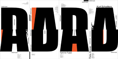
-Dada Book - ME U WE-
This book designed by Russian Design Agence "ME U WE" is a visual representation of Dadaism - An avant garde sub movement of Modernism, as a reaction to World War 1.
Carl Jung once said "its too idiotic to be schizophrenic" as a response to Dadaism, which is an obvious feature of the layout in this book. However, the book clearly has it's Moderisnist features: the layout of the type, the use of Grotesque and simple shapes.
----------------------------------------------------------------------------------------------
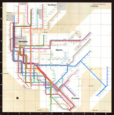
-New York Underground Poster (1972) - Massimo Vignelli-
Possibly the most iconic and definitely the most functional piece of Modernist design ever produced. During the film Helvetica, Vignelli mentions hows this was made "50 % visual, 50 % verbal". To me this map couldn't be any simpler. Not only do the colour codes and structure use of type make it easy to read, but the geography of New York is also made easy to understand.
However, being the obsessive Modernist Vignelli is, he thinks he could make it even more functional, by turning expressing the water as black instead of beige!
----------------------------------------------------------------------------------------------
-Neue Grafik - Carlo Vivarelli-
Vignelli describes Modernism as "never a fad", which is obvious here. Vivarelli's design is timeless. It could have been produced over half a century ago, or yesterday, there is no obvious features that render the design dated.
It is also highly funtional. The text is divided simply into paragraphs in each language, in the same order as the titles: German, English then French.
----------------------------------------------------------------------------------------------
-Bridging The Gap - Ross Gunter-
A highly functional poster design. The use of yellow and black has scientifically been proven to be the most visible combination of colour, so here the text couldn't be any more crisp. Despite a huge gap in time, both this piece and the previous look like they could have been produced at the same time.
----------------------------------------------------------------------------------------------
-Adidas Originals Branding - Bibliotheque Design-
This set of work was meant to coincide with the 2004 Athens Olympics. It is clear that the agency wanted to emphasise the "Originals", aka the history of the brand, which is why they chose to create something Modernist.
Modernist features include the sans serif type, as well as no use of pointless information or slogans (like Nike often have their slogan "Just Do it"). Only the most basic of information has been shown.
-Post - Modern Design-
-1984 Olympic Poster - Sussman-
I guess this image could be a good comparison with the contrasting Modernist image from above. The rejection of Modernism is obvious here by many features: the layered use of different media, clashing colour schemes and imagery. In my opinion, it encapsulates the history of the Games, but unfortunately lacks the discipline of the Games in its' style if design.
----------------------------------------------------------------------------------------------
This "editorial" couldn't be much more of a rejection to Modernism. The most obvious feature of Post Modernism is the use of WingDings as type, which really is sticking two fingers up to Vignelli. The article has absolutely no function, and only communicates a name, and even that has been obstructed. Carson mentions in the film Helvetica "accidents can be good", but here I think the accident has been used as a statement, and is not a huge leap in Graphic Design, be it Post Modern or not.
----------------------------------------------------------------------------------------------
-Headcase - Album Artwork And Poster-
Headcase are a local Thrash / Hardcore band from near where I live. Their music is loud, aggressive and messy. It is clear that they want to replicate the DIY approach in the promotion of them in this poster, amongst other bands of a similar genre.
The poster has a "can't be bothered" Punk approach to it, shown by the use of lined paper and hand written type. The image has just been cut up and stuck on, replicating the work of Reid and Garrett in the late 70's. There is absolutely no structure, and the choice of image is entirely random.
I do not think these pieces were purposely Post Modern, as they were not produced by trained designers. However, it is still clear that the designers had an overal aesthetic which they had considered, and I think if they knew what Modernism was, they would have chosen to avoid it.
I do not think these pieces were purposely Post Modern, as they were not produced by trained designers. However, it is still clear that the designers had an overal aesthetic which they had considered, and I think if they knew what Modernism was, they would have chosen to avoid it.
This album artwork for their debut Ep "Grime and Punishment" is messy and entirely emotive. There are no clean lines, and certain no use of Grotesk type.
----------------------------------------------------------------------------------------------
-Style And Subversion 1970-1990 - Nigel and Halliday-
This poster for the the V & A has multiple Post - Modern qualities to it. At first glance the poster is extremely Kitsch. This is due to the badly chosen colour scheme, as well as lack of rules regarding it's composition and choice of image. However, it does represent Post Modernism well, and clearly shows a rejection of rules.


