Archive for October 2012
OUGD404 - The History Of Visual Literacy
Every shape and form has meaning constructed from it's context. As shown above (through a search on google images), a "cross" can have many different meanings. When composed of a vertical line crossing a vertical line equally, this symbol is made: +. This can represent: a plus sign, a first aid kit, the swiss flag. The reason you can see it as a Swiss Flag is because of the colour and box around it.
When the proportions are changed, it can related to Christianity, and when inverted, the sign represents the worshipping of the devil.
Visual Communication: A level of shared understanding of shapes and symbols.
Many factors are key when looking at communication:
-Colour
-Negative / Positive Space
-Proportions
-Social Context
Semiotics:
-Symbolism
-Sign
-Signifier
Example: The Apple Logo - One of the most iconic designs in the world.
Symbolism: The symbol is that of an apple with a bite taken out of it.
Sign: A brand of computer. When lit up on a Macbook, shows that the laptop is on.
Signifier: Simplicity, clean, easy. An apple is often associated with learning.
Visual Language In Graphic Design Is Composed Of:
-Format
-Frame
-Figure/Form
Visual Dynamics
-Composition
-Type/Image
-Colour
-Layout
-Legibility/ Readability
-----------------------------------------------------------------------------------------------------
5 Different Fonts Found On Fontbook:
Helvetica
-Clean and timeless.
-Modernist and functional.
-Grotesk.
Bauhaus 93
- Heavy weight.
Curved/ Geometric.
- Architectural.
Devangali Sangam MN
-Sanskrit type, with letters I am entirely unfamiliar with. However, the shape and form of them are completely different to type I am used to.
Century Gothic
-Sans Serif, minimal and quite light.
Times New Roman
-Most famous and used serf, as it is the default font on Windows.
-----------------------------------------------------------------------------------------------------
4 Examples of Design
I like...
Zito's Sandwich Shoppe - Tag Collective - Branding
The idea was to create a brand thats fits well with the rich heritage of Italian Cafes in Brooklyn, New York. I think the overal design has a classic feel, and all the pieces work well together.
iQ Toyota Typeface - Pierre Smeets and Damien Aresta
A typeface composed of the manoeuvrability of a car. Really inspiring use of media, as well as a fantastic engaging video to watch.
I hate:
This website is the most difficult website to understand in the world. I have read every single word on the page, yet still have no clue what the website is about. The navigation is appalling not to mention the poor quality of image.
Info Graphics are meant to be clear and concise, yet the Japanese have almost become famous for communicating crude or misunderstood messages.
Here the sign mentions every single agonising way in which you should not use a toilet.
Sunday, 28 October 2012
Categories:
OUGD404,
OUGD404 - The History Of Visual Literacy
|
Comments Off
OUGD403 - Studio Brief 1 - Message & Delivery: Research
The article I chose to study was from the Daily Star. I chose to look at a "trashy" tabloid, as these seem to always be the most opinionated.
-----------------------------------------------------------------------------------------------
CALL 999! HERE COME THE GIRLS
BOOZED-UP women on violent rampages have been captured on camera.
A shocking documentary laid bare the antics of female thugs who brawl in the street and carry knives in their handbags.
The Channel 4 film revealed binge-drinking girls lashing out at police and yelling foul abuse when it aired last night.
Horrified Esther Rantzen hit out at the wild women’s families after watching 999: What’s Your Emergency?
She said: “Where are the mothers of these loutish, brutalised girls? These extremely young women seem so determined to self-destruct it makes me wonder if they ever had a loving role model.”
The film, shot in Blackpool, also featured scenes of violence perpetrated by women against their boyfriends. Blokes were left with blood running down their faces after being stabbed by girls.
ChildLine president Esther, 72, said: “Things have changed over the past 20 years. Fighting was a man’s world. Now, women are expected to be violent.”
-----------------------------------------------------------------------------------------------
Having read the article, the response to this Channel 4 documentary was shocking. I decided to delve deeper, and watch it myself (watch it here)
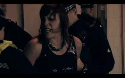
I decided to take down notes, taking quotes from both police officers and the general public. The programme was shocking, and utterly disgusting. Of course I have seen women drunk before, but I did not realise to what extent the Police had to deal with. Many of the officers even confessed they would prefer to be involved with men when an innocent occurs than women.
Below are some screen shots I took whilst watching it:
An opening qute from one of the female police officers.
One officer mentioned "more often than not, it's the blokes who have to look after the women. They try and keep up with the drinking, but the fact of the matter is, women can't."
A woman arrested, having assaulted a member of the public, then attempting to assault a police officer.
An visually interesting set of frames, showing the woman from the previous crime locked up in a cell.
A 17 year old girl being arrested for assault.
The most gruesome and shocking clip: A woman gets sliced in the cheek with a kitchen knife by a supposing "friend". She later mentions that they have made up.
Binge Drinking And It's Effects
Crime and Alcohol:
I researched into the influence of alcohol with crime, and this is what I found:
Alcohol is a factor in:
- One in three (30%) sexual offences.
- One in three (33%) burglaries.
- One in two (50%) street crimes.
(drinkaware.co.uk)
It is also estimated that the government spent roughly £ 7.3 billion a year to combat alcohol related crime.
- In 1999 there were an estimated 1.2 million
incidents of alcohol-related violence -
approximately 23,000 per week (Richardson, A.
and Budd, T., 2003)
-One in five violent crimes takes place in or around
pubs and clubs, 70% of these incidents took
place on weekend evenings (Richardson, A. and
Budd, T., 2003)
(www.alcoholconcern.org.uk)
- Women and Alcohol:
- Women absorb alcohol into the bloodstream faster and metabolize it slower than men.
- Women who drink regularly are at a much higher risk of liver damage than men even if they drink less or drink for a shorter period of time.
- Women develop alcoholic liver disease after a comparatively shorter period of heavy drinking and at a lower level of daily drinking than men.
- Proportionately more alcoholic women die from cirrhosis than alcoholic men.
- The odds of women experiencing sexual aggression were nine times higher on heavy days of alcohol consumption compared with days of no alcohol consumption.
- There is a greater incidence of alcohol misuse in women with eating disorders, especially bulimia, than in the general population.
(www.brad21.org)
Graphic Design Research:
As most of my research I have found is facts, I wanted to see how these can be interpreted through info graphics, as shown below.
I really like the style and simplicity of these, and I would love to interpret the facts I have collected visually.
Binge Drinking Campaign Posters:
I looked at ways binge drinking is campaigned to be stopped in existing adverts. I focussed on images where the audience is that of young women.
A key theme occurring about the message of the adverts is: When women drink too much, they are likely to be left vulnerable to other dangers. However, having watched "999: What's The Emergency", I noticed that more often than not, the women were causing the trouble, not being the ones affected by a crime. The idea that women are victims and men are the culprits seems to have become dated, and now there is no difference.
Similarly to the above imagery, I could look at promoting an ad towards women. However the focus could be the dangers of alcohol abuse and violence as oppose to vulnerability.
Crit:
I had a group crit with my classmates and my tutors, click here to see my post on my PPP blog about how the crit went.
Saturday, 27 October 2012
Categories:
OUGD403,
OUGD403 Message and Delivery: Research
|
Comments Off
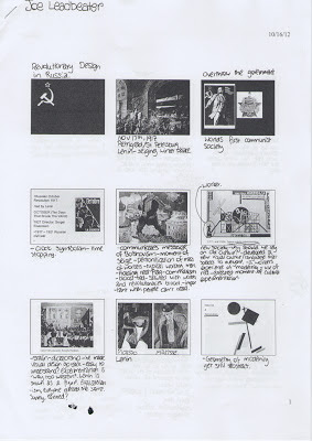
OUGD401: Lecture Notes - Revolutionary Design In Russia
Summary
- Revolution - A new opportunity for art to progress.
- Constructivists desire to make art useful.
- Aim that "art" should help construct a new society.
- Aim of new techniques and abstract aesthetic.
- By the end of 1935, everything reverted to "Social Realism"
Wednesday, 17 October 2012
Categories:
Lecture Notes,
OUGD401
|
Comments Off
OUGD401 - Lecture Notes: Post - Modernism
Summary:
Post - Modernism is undefinable, apart from the fact that it is what proceeds after Modernism. Unlike Modernism, which has it's set rules, nothing can clearly be seen as an iconic Post - Mod piece. Post - Modernism is a reaction to a certain perception of the world in a given context, so it is entirely subjective.
Categories:
Lecture Notes,
OUGD401
|
Comments Off
OUGD401 - Study Task 2
In our seminar, we split into small groups, and discussed the positives and negatives of the recent Leeds College of Art prospectus. We considered the following points:
-Use of type
-Layout
-Purpose and meaning
- Target / potential audience
- Social / political context
-Does the solution solve the problem?
This is the list we came up with, noticing both general points as well as points specific to some pages:
Front Cover: -Confusing colour scheme.
- Cheap paper stock, and not aligned well, possibly due to the spine not being accounted for.
-The typeface is confusing, as the choice of O is too wide, making the type look uneven.
First Page: -This should stand out aesthetically, as it is the first page to be seen. However, it lacks creativity.
-Too many boxes, and looks like a Powerpoint presentation.
-"Next - level" wording?
- Long winded phrasing.
Page 7: -Far too much text for an audience wanting to do a creative and visual degree.
-All the text is the same weight, so the text seems to look more dense.
-Bad alignment/ spacing.
Page 14: Terrible photography. Lighting should be much softer, and the person in the foreground should not even be in the photo. It is also not clear what the photo is showing.
Page 17: This page is typical of the prospectus, with two things I do not like:
-The pictures are small and dotted around the page, so detail cannot be seen.
-The photo of the paint brushes is an obvious stock photo, and the images seem to communicate very little.
Page 24: This page gives very little information about the college. The photo contradicts the text, as the text talks about getting "fit", yet the supposing students are playing Table Football. The photo is also badly lit, and not taken in Leeds College of Art.
Page 36: One positive I have - the image is full page! I the usage of a full page photo as it seems to split the prospectus up slightly, taking away from its' monotony. However, the photo subject is boring and does not make any sense.
General Problems
- Poor image selection - often stock photos, or photos that do not communicate anything.
-Poor image quality. Lighting and focus need to be taken into consideration further, as well as subject.
-Images are often too small.
-Confusing text alignment.
- Text is too dense. A large group of text makes each page seem monotonous and unexciting.
Suggestions
-Make navigation of each degree much easier than just a contents page. The use of colour coding or full page titles could do this.
-Include relevant, well thought out photos on a larger scale.
-Make photos the priority Every degree studied at LCA is visual, so why can't information be presented in this way?
- Split text up. Different weights, fonts, colour, etc..
Thursday, 11 October 2012
Categories:
OUGD401,
Study Task
|
Comments Off
OUGD401 - Study Task 3
Following our critical analysis of the LCA Prospectus, we worked in groups analysing two images, looking at both differences and similarities.
We considered:
- Context of each image - When and where were they produced?
- Use of type - Are they typical of an era / how are they used to anchor or relay the image?
- Imagery - Connotations as well as the obvious denotations.
- Purpose - Why were each of them made?
- Audience - Considering a social demographic.
First Image - "The Uncle Sam Range" - 1876
Summarised Notes:
-USA - Patriotic - As shown by usage of US flag decor.
-Uncle Sam - Seen as a "US mascot'
-Black Servant - pre- slavery abolishment.
-Clock - shows the time as "1776 - 1876" - The poster was produced 100 years since the US claimed independence.
-Type - A "Wild West" style to it.
-The world and his list - Countries around the world have been stereotyped to make the US seem greater, eg next to China is written "birds nests, boiled grasshoppers, rats", and next to Ireland is "potatoes: boiled, stewed, roasted, mashed, raw"
- Advertisement for an oven - the oven is sold on virtues, based on a symbolic value.
Second Image - Poster by Savile Lumley - 1915
-World War 1 Propoganda - "The Great War" - This shows it was produced before WW2, as a second war wasn't predicted.
-Time of production - 1915
- Tudor Rose on the curtains - A heraldic symbol of England - symbolising England.
- Fleur - De - Lis on chairs - The 3 leaves represent: Those who work, those who thought, and those who prayed.
-The message relies on guilt, and is directed at fathers who at the time were the "bread winner"'s of the household.
Similarities
-Both rely on patriotism, and portray the cultures of their countries.
Differences
-The first seems to be much more obviously patriotic, but is a clever use of advertising.
-The second also uses patriotism to it's advantage but promotes joining the army instead of a material product.
500 Word Essay
The first image entitled "The Uncle Sam Range" is a subtle advert for an oven. Despite this, the position of the product is not centred or made obvious. There is no description of the product itself, and not even use of the word "oven". Instead, there is clear usage of American patriotism to sell the product, such as the coloured decor and the presence of Uncle Sam, a known US iconic figure. There is also the presence of the US national bird, the bald eagle, as well as a clock with "1776 - 1876", representing the hundred year anniversary of the independence of the United States of America.
The second image also uses symbolism to its advantage, in order to rely on English patriotism. However, here it is much more subtle. with the usage of the Fleur - De - Lis on the chair, symbolism of "Those who work, those who thought, and those who prayed", according to French historian Georde Duby. This obviously fits well, as the advert is promoting English men to join the army. Another use of patriotic symbolism is the English Rose, imprinted into the curtains.
Interestingly, despite both the images sharing patriotism, they're used in different ways. The first image uses it in a way to promote the oven in a style of advertising that is still used today, where the product is promoted in a way the buyer feels it will gain them status. Essentially, the message communicated is "buy this product and you are a good American".
The second advert relies on guilt, and communicates "if you don't fight in this war, your children will be ashamed of you". This is made clear by the written phrase of rhetoric spoken discourse, supposedly said by the daughter: "Daddy, what did YOU do in the Great War?". The use of the emphasised second person personal pronoun "YOU" directs the question not just to the man pondering his thoughts in the image, but mainly to the chosen audience, the bread winners of the household. This works particularly well in it's context, as traditionally men were meant to be in charge of decisions. To seem weak to your spouse or children is something a man of that time would definitely want to hide or to stop from happening.
The second advert relies on guilt, and communicates "if you don't fight in this war, your children will be ashamed of you". This is made clear by the written phrase of rhetoric spoken discourse, supposedly said by the daughter: "Daddy, what did YOU do in the Great War?". The use of the emphasised second person personal pronoun "YOU" directs the question not just to the man pondering his thoughts in the image, but mainly to the chosen audience, the bread winners of the household. This works particularly well in it's context, as traditionally men were meant to be in charge of decisions. To seem weak to your spouse or children is something a man of that time would definitely want to hide or to stop from happening.
Both pieces share the same audience, that of an alpha male. As previously mentioned, the second image's audience is men who want to do something for their country in the form of fighting. This advert was also produced when it was not made compulsory for men to join the army, so had to direct it's audience well and be persuasive. The audience for it is also made obvious by the man in the advert, as he is supposedly meant to be a stereotypical husband/ father. The first advert's audience is made clear by oppression. A woman is serving food, whilst a black man is taking a chicken out of the oven. Therefore, the audience is, once again, the white male who earns the families' keep.
Categories:
OUGD401,
Study Task
|
Comments Off


