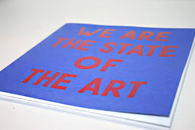
In our seminar, we split into small groups, and discussed the positives and negatives of the recent Leeds College of Art prospectus. We considered the following points:
-Use of type
-Layout
-Purpose and meaning
- Target / potential audience
- Social / political context
-Does the solution solve the problem?
This is the list we came up with, noticing both general points as well as points specific to some pages:
Front Cover: -Confusing colour scheme.
- Cheap paper stock, and not aligned well, possibly due to the spine not being accounted for.
-The typeface is confusing, as the choice of O is too wide, making the type look uneven.
First Page: -This should stand out aesthetically, as it is the first page to be seen. However, it lacks creativity.
-Too many boxes, and looks like a Powerpoint presentation.
-"Next - level" wording?
- Long winded phrasing.
Page 7: -Far too much text for an audience wanting to do a creative and visual degree.
-All the text is the same weight, so the text seems to look more dense.
-Bad alignment/ spacing.
Page 14: Terrible photography. Lighting should be much softer, and the person in the foreground should not even be in the photo. It is also not clear what the photo is showing.
Page 17: This page is typical of the prospectus, with two things I do not like:
-The pictures are small and dotted around the page, so detail cannot be seen.
-The photo of the paint brushes is an obvious stock photo, and the images seem to communicate very little.
Page 24: This page gives very little information about the college. The photo contradicts the text, as the text talks about getting "fit", yet the supposing students are playing Table Football. The photo is also badly lit, and not taken in Leeds College of Art.
Page 36: One positive I have - the image is full page! I the usage of a full page photo as it seems to split the prospectus up slightly, taking away from its' monotony. However, the photo subject is boring and does not make any sense.
General Problems
- Poor image selection - often stock photos, or photos that do not communicate anything.
-Poor image quality. Lighting and focus need to be taken into consideration further, as well as subject.
-Images are often too small.
-Confusing text alignment.
- Text is too dense. A large group of text makes each page seem monotonous and unexciting.
Suggestions
-Make navigation of each degree much easier than just a contents page. The use of colour coding or full page titles could do this.
-Include relevant, well thought out photos on a larger scale.
-Make photos the priority Every degree studied at LCA is visual, so why can't information be presented in this way?
- Split text up. Different weights, fonts, colour, etc..


