Showing posts with label OUGD403. Show all posts

OUGD403 - Studio Brief 1 - Message & Delivery: Research

The article I chose to study was from the Daily Star. I chose to look at a "trashy" tabloid, as these seem to always be the most opinionated. 


The article is as follows, or can be found here.

-----------------------------------------------------------------------------------------------

CALL 999! HERE COME THE GIRLS


BOOZED-UP women on violent rampages have been captured on camera.

A shocking documentary laid bare the antics of female thugs who brawl in the street and carry knives in their handbags.

The Channel 4 film revealed binge-drinking girls lashing out at police and yelling foul abuse when it aired last night.

Horrified Esther Rantzen hit out at the wild women’s families after watching 999: What’s Your Emergency?

She said: “Where are the mothers of these loutish, brutalised girls? These extremely young women seem so determined to self-destruct it makes me wonder if they ever had a loving role model.”

The film, shot in Blackpool, also featured scenes of violence perpetrated by women against their boyfriends. Blokes were left with blood running down their faces after being stabbed by girls.

ChildLine president Esther, 72, said: “Things have changed over the past 20 years. Fighting was a man’s world. Now, women are expected to be violent.”

-----------------------------------------------------------------------------------------------

Having read the article, the response to this Channel 4 documentary was shocking. I decided to delve deeper, and watch it myself (watch it here)

I decided to take down notes, taking quotes from both police officers and the general public. The programme was shocking, and utterly disgusting. Of course I have seen women drunk before, but I did not realise to what extent the Police had to deal with. Many of the officers even confessed they would prefer to be involved with men when an innocent occurs than women.

Below are some screen shots I took whilst watching it:

An opening qute from one of the female police officers. 

 One officer mentioned "more often than not, it's the blokes who have to look after the women. They try and keep up with the drinking, but the fact of the matter is, women can't." 

 A woman arrested, having assaulted a member of the public, then attempting to assault a police officer. 

 An visually interesting set of frames, showing the woman from the previous crime locked up in a  cell. 

 A 17 year old girl being arrested for assault. 

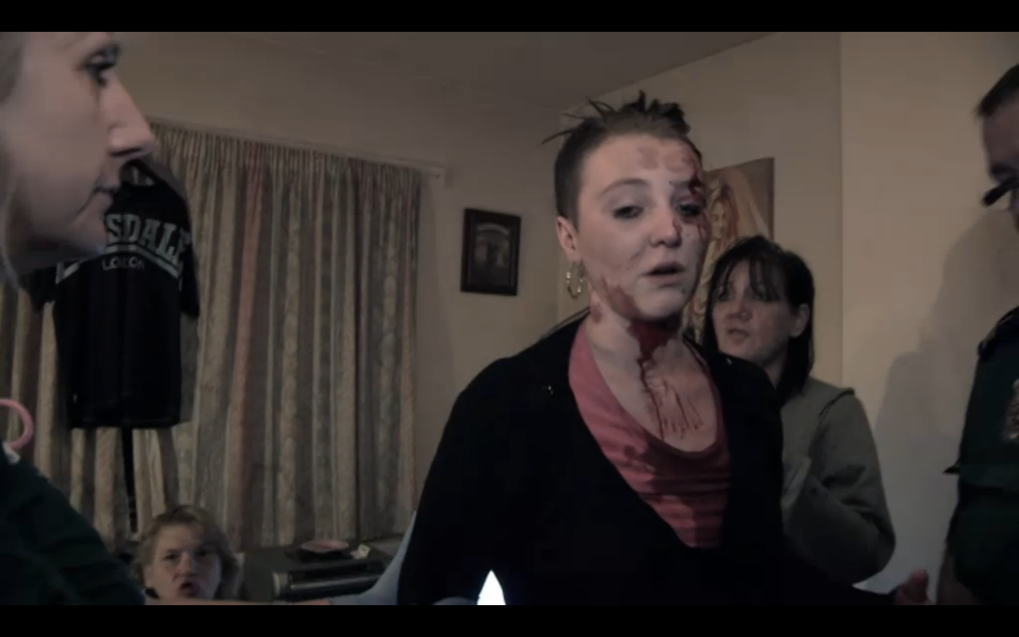
The most gruesome and shocking clip: A woman gets sliced in the cheek with a kitchen knife by a supposing "friend". She later mentions that they have made up. 


Binge Drinking And It's Effects


Crime and Alcohol: 


I researched into the influence of alcohol with crime, and this is what I found:


Alcohol is a factor in:
  • One in three (30%) sexual offences.
  • One in three (33%) burglaries.
  • One in two (50%) street crimes.

(drinkaware.co.uk)


It is also estimated that the government spent roughly £ 7.3 billion a year to combat alcohol related crime. 


 - In 1999 there were an estimated 1.2 million 
incidents of alcohol-related violence - 
approximately 23,000 per week (Richardson, A.
and Budd, T., 2003) 

  -One in five violent crimes takes place in or around

pubs and clubs, 70% of these incidents took
place on weekend evenings (Richardson, A. and
Budd, T., 2003) 

(www.alcoholconcern.org.uk) 


    Women and Alcohol:


(www.brad21.org)

Graphic Design Research:


As most of my research I have found is facts, I wanted to see how these can be interpreted through info graphics, as shown below. 


I really like the style and simplicity of these, and I would love to interpret the facts I have collected visually. 

Binge Drinking Campaign Posters:

I looked at ways binge drinking is campaigned to be stopped in existing adverts. I focussed on images where the audience is that of young women. 


A key theme occurring about the message of the adverts is: When women drink too much, they are likely to be left vulnerable to other dangers. However, having watched "999: What's The Emergency", I noticed that more often than not, the women were causing the trouble, not being the ones affected by a crime. The idea that women are victims and men are the culprits seems to have become dated, and now there is no difference. 

Similarly to the above imagery, I could look at promoting an ad towards women. However the focus could be the dangers of alcohol abuse and violence as oppose to vulnerability. 

Crit:

I had a group crit with my classmates and my tutors, click here to see my post on my PPP blog about how the crit went. 


Saturday, 27 October 2012
Categories: , | Comments Off

OUGD403 Visual Thinking: Alphabet Soup: Typeface


The brief instructs that I produced an entirely typeface, in either capitals or lower- case, as well as glyths. 

The typeface is meant to reflect the characteristics or personality of my given partner: Jamie Pudsey. 

We got into our pairs, and filled out a questionnaire about each other's lives:

I found that some of the questions that were set did not give much away about Jamie's character, so we decided to delve deeper and produce our own questions:

I found that my page was hard to work with, and so I reproduced it in spider - diagram form, and split the information I found out into simple and open categories:

Family: -He grew up in Bristol, and has an older brother aged 25. Below: The Clifton Suspension bridge, one of Bristol's most iconic landmarks. 


-Music-

Bristol is also famously a city of culture, and Jamie mentioned he really likes Deep House, with artists such as "Julio Bashmore" and "Disclosure". 


Julio Bashmore - Battle For Middle You


Disclosure - Blue You

Jamie also mentioned he was fond of "Old School Hip Hip", his favourite artists being "2Pac" and "A Tribe Called Quest" 


2Pac - Changes


A Tribe Called Quest - Can I Kick it?

Music Analysis: I wanted analyse his music taste, as I find this can often reflect someones personality. 
- Deep House - Electronic, ambient, organic, soft, soothing, repetitive, easy listening. 
- Hip Hop (chosen artists) - Intelligent lyrics, simple repetitive beats, thought provoking. 

-Overall - Thought provoking, simple and structured, and not too "noisy". 

-Art/ Design-

Fine Art

Rothko - Jamie told me he is a fan of Rothko, and so once again, I pulled apart Rothko as an artist to see how the aesthetics reflects Jamie's personality. 
-Depth. Rothko's work is produced from layers and layers of paint which give them depth and create the illusion of space. 
-Thought Provoking. I find that when looking at Rothko's work, your imagination is stimulated, as your brain tries to read the image. 
-Organic. Rothko's general colour schemes are organic tone - based. 

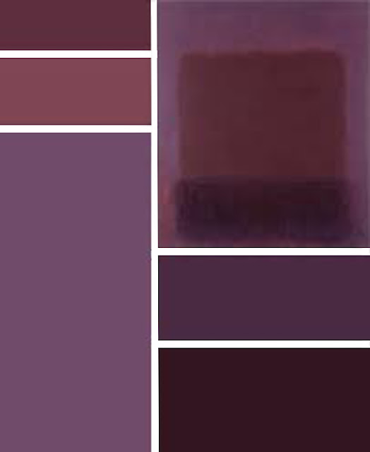
Colour: Jamie told me his favourite spectrum of colours are: blues, purples and greens. I decided to look focus my analysis of Rothko's work just down to pieces with colour schemes of this nature.

Below: I have pulled apart the main colours from each of these Rothko pieces and produced colour charts to express these. 


Graphic Design

Peter Saville - Joy Division Album Cover - Jamie told me this iconic piece of design is the top piece that he would have liked to have designed. 

This shows Jamies illustrative side, and shows he generally likes quite simple design. 


Jamie's Own Art/Design

In order to look at Jamie's interests further, I wanted to look at work he had produced, as it shows how his inspiration is reflected into his own work. 


Ceramic scupltures Jamie produced on his foundation. 


A wire drawing of the lungs. 


A typeface based on veins and arteries. 


-Development of Concept-

I noticed two common themes in Jamie's interests:
-Organic Form
-Thought Provokation

Organic - Music: He listens to Deep House, an organic sounding genre. 
Rothko: Earthy tones used in his work. 
Saville: Organic shape and form. 
His Own Art: Generally likes to used organic media. 

Thought Provokation - Music: Both Hip - Hop artists create vivid imagery in their lyrics. 
Rothko: His work has depth and stimulates the mind. 

Jamie has also told me that he is conscious of the environment, and that he likes to eat lots of fruit and vegetables. From this reasoning, I have decided to explore Organic Aesthetic. 

Inspiration

Terrence Malick - The Tree of Life: This film contains beautiful shots of nature. Theres footage produced of micro objects (eg. cell reproduction), as well as macro (eg. cloud formation) 


----------------------------------------------------------------------------------------------

Nastplas - Organic Type: In this piece, the choice of material and the process itself is interesting to me. The colour scheme is also earthy and neutral, which would be ideal for my type.


----------------------------------------------------------------------------------------------

Martin Wenzel - FF Duper Font - Organic Type: Wenzel has create a highly detailed, handwritten style typeface, with a home - made, friendly and organic feel. A whole family has been produced, with a huge range of glyphs. I also like how there are multiple variations for each letter, so the hand - made feel is taken further. 

I also like how it feels organic, yet is still clear and visible. When I create my typeface, I plan to base it on a very clear font, and give it a subtle, handmade feel.


----------------------------------------------------------------------------------------------


Leaf Script Style: An old, traditional style of letterform. I love the flowing feel of the letters, as well as being organic. As previously mentioned, I want my letters to be clear, but also feel organic, and I think this style does both. 


The brief also mentions that the letters have to be hand rendered, which cannot be avoided with this style. 


Crit:

I showed this research to a group in a power crit, click here to see how I intend to use my context into practise. 


Wednesday, 10 October 2012
Categories: , | Comments Off

OUGD403: Alphabet Soup: Visual Thinking - Part 1

Brief: 

Group Visual Research

We split into our groups and shared our 30 different typefaces we found over the summer. There were 6 of us in our group, meaning we had 180 typefaces to explore and analyse. We split these into 10 separate groups titles by the following:

-Upper Case - EXAMPLE
-Lower Case - example
-Serif - eg. Times New Roman
-Sans Serif - eg. Verdana 
-3D
-Geometric Shapes 
-Minimalist - Thin and simple Type. 
-Real Media - Anything that is not  produced digitally   
-Unstructured -Typefaces constructed without a grid.
-Symbolic - Typefaces that look obscure and cannot be understood. 


Identifying these groups helped me gain knowledge on existing type before I randomly selected my word to work on: 

POP

Research Into "Pop"

Dictionary Definition:


pop

1  [pop] verb, popped, pop·ping, noun,adverb, adjective


Verb (used without object)
- to make a short, quick, explosive soundThe cork popped.
to burst open with such a sound, as chestnuts or corn in roasting.
to come or go quickly, suddenly, or unexpectedly: She popped into the kitchen to check the stove.
to shoot with a firearm: to pop at a mark.
- to protrude from the sockets: The news made her eyes pop.

Noun
a short, quick, explosive sound.
a popping.
- a shot with a firearm.
-Informal soda pop. A drink or portion of an alcoholic beverage, as a drink of whiskey or a glass of beer: We had a couple of 
pops on the way home.

a pop, Slang each; apiece: five orchids at $30 a pop.
pop in, Informal to visit briefly and unexpectedly; stop in;drop by: Maybe we'll pop in after the movie.
pop the question, Informal to propose marriageThey dated for two years before he popped the question.


Thesaurus Definition:

Main Entry:
pop 
Part of Speech:noun
Definition:bang
Synonyms:


Artist Research

Daisy Lew - 3D Pop Up Book Art

Although the outcome has to be 2D, I decided to look at Pop Up books. Daisy Lew produces pop up books with far more depth and layers than your typical pop up, as shown below with her creation of New York Cityscapes. 


Scott McCarney

Similarly to Lew, McCarney Creates what he calls "visual books". Here I have focussed on the type he has produces using folds and pop up: 


Existing Typefaces 

Bubbleboddy

As the name suggests, this font has been inspired by the shape of bubbles, an object I instantly think of when the word "Pop" is concerned. I like the simplicity of this typeface, and if I was to use it, my work would definitely have clarity in terms of it's communication. 


Doughboy - Lucas Sharp

I really like this Typeface by Lucas Sharp. Despite it not looking that "bubble like", I like the space in which it takes up, and like the idea of filling it with bubbles. 


Bubblewrap Type - Lo Siento

As previously mentioned, I liked the idea of working with pattern, and this concept for the cover of +81's magazine by Lo Siento works fantastically with the word "Pop".  Siento has injected a select number of bubbles in the wrap with coloured water in order to create type. I feel inspired to use pattern in my design, but there is no way I could replicate this concept without copying it! 


Pop - A Palindrome 

Wikipedia defines a Palindrome as:   "a word, phrase, number or other sequence of units that may be read the same way in either direction, with general allowances for adjustments to punctuation and word dividers." 
eg. RACECAR.

It can also work at multiple angles, with different words:

S T E P 
T I M E
E M I T 
P E T S

I want to look at this concept, as POP fits it. I like the idea of looking at the shape and form of the word, instead of the literal meaning. 

I have also previously mentioned I like the use of pattern, so I intend to look at both pattern and mirroring of type. 

My experimentation with the manipulation of the word "POP" can be found here, on my Design Practise Blog. 


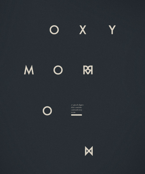
Oxymoron - Koyuki Inagaki

Inagaki has created a typeface entitled "Oxymoron", as it supposedly mimics it's meaning. This has been done by creating a reflection directly down the middle of each letter. I intend to experiment with this, as well as different reflection lines, vertical, horizontal and diagonal. 


Patterns

I like the idea of working with mirrored patterns, and intend to use them when creating my type in some way. I also intend to work solely in black and white, as shape and form are my priorities over tone or colour. 


Saturday, 6 October 2012
Categories: , , , , | Comments Off