The brief instructs that I produced an entirely typeface, in either capitals or lower- case, as well as glyths.
The typeface is meant to reflect the characteristics or personality of my given partner: Jamie Pudsey.
We got into our pairs, and filled out a questionnaire about each other's lives:
I found that some of the questions that were set did not give much away about Jamie's character, so we decided to delve deeper and produce our own questions:
I found that my page was hard to work with, and so I reproduced it in spider - diagram form, and split the information I found out into simple and open categories:
Family: -He grew up in Bristol, and has an older brother aged 25. Below: The Clifton Suspension bridge, one of Bristol's most iconic landmarks.
-Music-
Bristol is also famously a city of culture, and Jamie mentioned he really likes Deep House, with artists such as "Julio Bashmore" and "Disclosure".
Julio Bashmore - Battle For Middle You
Disclosure - Blue You
Jamie also mentioned he was fond of "Old School Hip Hip", his favourite artists being "2Pac" and "A Tribe Called Quest"
2Pac - Changes
A Tribe Called Quest - Can I Kick it?
Music Analysis: I wanted analyse his music taste, as I find this can often reflect someones personality.
- Deep House - Electronic, ambient, organic, soft, soothing, repetitive, easy listening.
- Hip Hop (chosen artists) - Intelligent lyrics, simple repetitive beats, thought provoking.
-Overall - Thought provoking, simple and structured, and not too "noisy".
-Art/ Design-
Fine Art
Rothko - Jamie told me he is a fan of Rothko, and so once again, I pulled apart Rothko as an artist to see how the aesthetics reflects Jamie's personality.
-Depth. Rothko's work is produced from layers and layers of paint which give them depth and create the illusion of space.
-Thought Provoking. I find that when looking at Rothko's work, your imagination is stimulated, as your brain tries to read the image.
-Organic. Rothko's general colour schemes are organic tone - based.
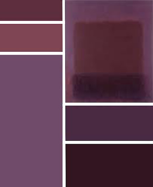
Colour: Jamie told me his favourite spectrum of colours are: blues, purples and greens. I decided to look focus my analysis of Rothko's work just down to pieces with colour schemes of this nature.
Below: I have pulled apart the main colours from each of these Rothko pieces and produced colour charts to express these.
Graphic Design
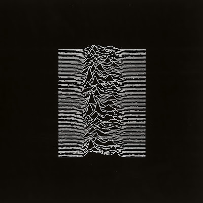
Peter Saville - Joy Division Album Cover - Jamie told me this iconic piece of design is the top piece that he would have liked to have designed.
This shows Jamies illustrative side, and shows he generally likes quite simple design.
Jamie's Own Art/Design
In order to look at Jamie's interests further, I wanted to look at work he had produced, as it shows how his inspiration is reflected into his own work.
Ceramic scupltures Jamie produced on his foundation.
A wire drawing of the lungs.
A typeface based on veins and arteries.
-Development of Concept-
I noticed two common themes in Jamie's interests:
-Organic Form
-Thought Provokation
Organic - Music: He listens to Deep House, an organic sounding genre.
Rothko: Earthy tones used in his work.
Saville: Organic shape and form.
His Own Art: Generally likes to used organic media.
His Own Art: Generally likes to used organic media.
Thought Provokation - Music: Both Hip - Hop artists create vivid imagery in their lyrics.
Rothko: His work has depth and stimulates the mind.
Jamie has also told me that he is conscious of the environment, and that he likes to eat lots of fruit and vegetables. From this reasoning, I have decided to explore Organic Aesthetic.
Inspiration
Terrence Malick - The Tree of Life: This film contains beautiful shots of nature. Theres footage produced of micro objects (eg. cell reproduction), as well as macro (eg. cloud formation)
Nastplas - Organic Type: In this piece, the choice of material and the process itself is interesting to me. The colour scheme is also earthy and neutral, which would be ideal for my type.
----------------------------------------------------------------------------------------------
I also like how it feels organic, yet is still clear and visible. When I create my typeface, I plan to base it on a very clear font, and give it a subtle, handmade feel.
----------------------------------------------------------------------------------------------

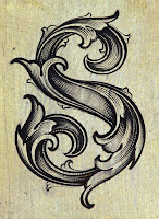
Leaf Script Style: An old, traditional style of letterform. I love the flowing feel of the letters, as well as being organic. As previously mentioned, I want my letters to be clear, but also feel organic, and I think this style does both.
The brief also mentions that the letters have to be hand rendered, which cannot be avoided with this style.
Crit:
I showed this research to a group in a power crit, click here to see how I intend to use my context into practise.


