I thought it would be good to look at existing publications,in order to find design influences or inspiration.
Květoslav Bartoš - 'Sayko'
I like quite a few things about this publication. It's interesting to experiment with one page being greyscale, and the other in colour, both on the same spread. I also like the use of stock / full colour pages to divide the book up. I also feel I could work with double page spreads of quotes at a large point size, similar to above.
Morten Rosendal - UNCUT Magazine
Link To Publication
Ricardo Leite - Lost Magazine
Link To Publication
Morten Rosendal - UNCUT Magazine
Link To Publication
One thing I really like about this publication is the subtle use of colour. I have always been a fan of monochrome or greyscale imagery, and the text highlights the page well. The magazine uses a different colour for each issue, working with a colour wheel. I feel this could be a great way to split up my publication into it's different sections.
MusaWorkLab - Home & Abroad
I love the simple use of colour in this catalogue. The use of both monochrome imagery and matching type creates strong consistency throughout the publication. I intend on experimenting with this in my publication, possibly using a different monochrome colour scheme for each section.
Javan Lehn Studio - Saturdays Magazine Issue #001
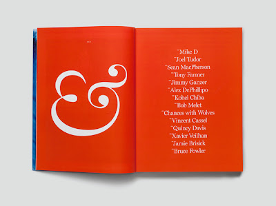
I love the use of quotes on the image above to cover the entire page. Depending on if I chose a suitable typeface, I could also replicate this with information from my interviews. The use of numbers sparked an idea for me to mark each section as a chapter, marked numerically.
Ricardo Leite - Lost Magazine
Link To Publication
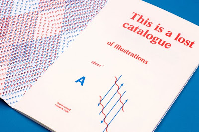
What I like about this publication is it's simple usage of two colours. This is something I could possibly work with, If I wanted to colour code specific sections of my publication.
Tobias Faisst - Größer Zwei (Bigger Two)
This publication is beautifully simple. I intend on producing something as easy as this to follow. I also like how the page numbers are significantly larger for the start of each chapter, as these prioritise over other page numbers.
Ricardo Martins - Cave
One thing I like about this magazine is the use of a strong and recognisable typeface. This helps create a strong identity and consistency throughout the publication. I also like the idea of significant page numbers cropped off the page, something I may apply to my work in the future.
Louise Mertens - Floating World
One thing I really like about this publication is it's use of imagery. I like how the same layout is used at the start of each chapter, involving a large image and the title on the right. I also really like the layout of the contents page.


