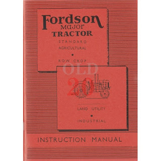
Instructional Booklets
As the book was intended to be informative, I wanted to look at the aesthetic of instructional book design, as I feel my book could have an almost instructional feel to it.
I did not want to use some elements of instructional booklets, as I found them to be boring.
The elements of instructional manuals I intend to use:
Linear Pattern: I like the use of pattern in instructional manuals, as you can see on the tractor manual and the 'final cartridge' manual.
Gradient: One reoccurring element of manuals seems to be a gradient. I intend to use this somehow within my design.
One of my pages, with both a linear pattern and gradient:
Royal Mail Stamp:
For some reason, I felt inspired by the ink patterned stamp Royal Mail post on their envelopes:
This pattern inspired me to a similar patterned background for one of my spreads:
Beat Magazine:
I like the simple, easy to read type used, especially the serif titles.
Use in my book - numbers:
Archizines.com
In general, I used this website to identify different layout in publications:
The Unlimited Edition - Local Stratford Newspaper
I really liked the way boxes with a basic drop shadow have been used to create titles within this magazine.


