Further visual research into Japanese posters:
Japanese Event Flyer: D-Shirt Exhibition. Daisuke Maeda. 2013
Japanese Exhibition Flyer: Wellness Design. Shin Matsunaga. 2007
Japanese Concert Poster: ToNoFon Festival. Gorow Ohno. 2011
Illustration: Battle of Nagashino. Bella Matribus Detestas. 2013
I like this combination of a sans serif typeface with sans serif Japanese type, something I could see working with.
Japanese Poster: Aoba Shokudo. Mitsuhiro Ikeda / Shun Sasaki. 2013
(Source: sasakishun)
Japanese Illustration: Setsubun. Ootsu Moeno. 2014
(Source: ootsumoeno)
Japanese Advertising: Suntory Red Whiskey. 1967
I like the use of playful typography here, in both Japanese and English. The poster is ugly, but I like the idea of using typography dotted around the poster.
Japanese Poster: PLAY / Tokyo Health Club. Tadashi Ueda. 2013
(Source: tadashiueda)
Japanese Poster: New Nature World Exhibition. Megumi Shibazaki. 2013
Japanese Movie Poster: Heat-Haze Theatre. 1981Japanese Poster: Kappo Maekawa: Japanese Gourmet Event. Keisuke Maekawa. 2013

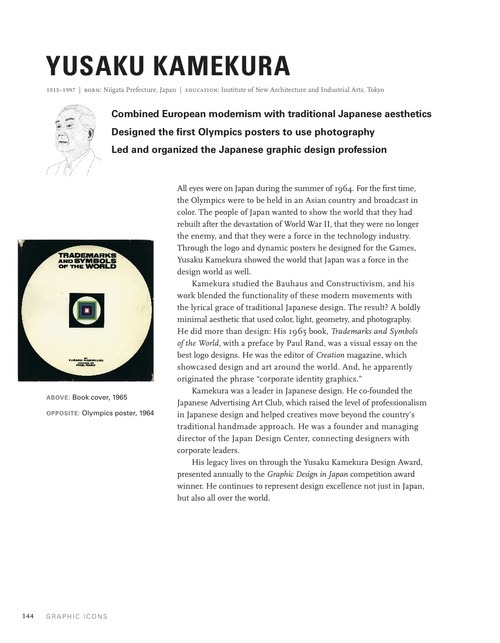
Over the past few decades, the work of Japanese designers has begun to make its way into the larger narrative representing the history of graphic design. Among these designers is Yusaku Kamekura. His influence can be seen not only in his works of design but also in his commitment to the promotion of design in Japan.
Released in 2013, John Clifford features Yusaku Kamekura in his book Graphic Icons: Visionaries Who Shaped Modern Graphic Design. Included here is an excerpt from the book introducing the Japanese designer’s life and work.
Some of Kamekura’s most well know design includes his colorful advertisements for Nikon and iconic posters for the 1964 Tokyo Olympics.
Gurafiku Review: Standout Japanese graphic design created in 2013.
Japanese Event Flyer: Lyric of Distant. Yuka Asai. 2013
(Source: comcomblue, via gurafiku)
Gurafiku Review: Most Popular on Gurafiku in September, 2013.
Japanese Graphics: Making Breakfast. Ryo Kuwabara. 2013
(Source: shirokuuma, via gurafiku)
Japanese Advertising: Nissan Laundry Soap. Hiroshi Ohchi. 1954
Gurafiku Review: Standout Japanese graphic design created in 2013.
Japanese Exhibition Poster: Between Human and Nature. Rikako Nagashima. 2013
(via gurafiku)
I love the use of colours in the poster below, as well as a sans serif Japanese typeface.
Japanese Book Cover: Real Anonymous Design. Kazuki Umezawa. 2013
(via gurafiku)
The use of black and white also seems to work well with complex Japanese type.
This poster is quite fun and experimental. I like the use of a monotone grainy background, reminiscent of Japanese patterns and textures.
Japanese Poster: Thursday. Yutaka Satoh. 2013
(Source: 571-0)
Japanese Theater Poster: Please Don’t Love. Nami Masuda. 2011
(via gurafiku)
(Source: shinpe-pp)
Gurafiku Review: Standout Japanese graphic design created in 2013.
Japanese Graphics: Amalgam. Tadashi Ueda. 2013
(Source: tadashi-ueda, via gurafiku)
The use of shape and form works well with the poster below.
(Source: shirokuuma)
Gurafiku Review: Most popular on Gurafiku in June, 2013.
Japanese Advertisement: SKIYARN. Womens knit fashion. 1955
(via gurafiku)
The colours below work really well together. This gold colour seems to be ubiquitous with Japanese design, something I definitely intend on using.
I feel the use of type below is abit too intense for a western audience to taken in, so something I shall stay clear of.
Gurafiku Review: Standout Japanese graphic design created in 2013.
Japanese Book Cover: Japanese Character Freestyle Complete. Ohara Daijiro. 2013
(Source: kogumarecord, via gurafiku)
Japanese Poster: Letters and Sunlight. Mitsuo Katsui. 2009
The poster below is fun and playful, but the style would not be appropriate for my audience.
Gurafiku Review: Popular on the Gurafiku Research Feed in 2013. Heaven Artist
I would love to work with images of the products that have been designed, and really like the tone of voice the poster below portrays.
Japanese Poster: App Arts Studio: Reproduction Techniques. 2013
Gurafiku Review: Most Popular on Gurafiku in May, 2013
Japanese Theater Poster: Sayonara Psychic Orchestra. Kohei Sekita. 2011
(via gurafiku)
I really like the use of intense colour below, but I feel would not be suitable for my brand.
Japanese Exhibition Poster: Koji Kakinuma: Exploring Calligraphy. Tokyo Pistol. 2013
Gurafiku Review: Standout Japanese graphic design created in 2013.
Japanese Theater Poster: Don’t Know How to Fall. Nami Masuda. 2013
(Source: kazukij, via gurafiku)
The poster below is interesting, and something I could see working as a gallery poster.
Gurafiku Review: Most Popular on Gurafiku in April, 2013.
Japanese Poster: Magaru My Girl / Maboroshi My Boy. Keisuke Maekawa. 2012
(via gurafiku)
Below you can see how custom Japanese letters can be formed. This is something I would like to experiment with.
Gurafiku Review: Popular on the Gurafiku Research Feed in 2013. Rainy Season.
Shapes have been utilised well in the poster below, to create something architectural and visually appealing.
2013 Gurafiku Review: Standout Japanese design created in 2013.
Japanese Exhibition Poster: Dismantlement and Blue-Sky Daydreams. Hirofumi Abe. 2013
(via gurafiku)
A very conceptual monochromatic poster below. It's also interesting to see Japanese type hand rendered.
Japanese Theater Poster: Live x Sleep. Takara Mahaya. 2012
(Source: panorama-live)
Japanese Exhibition: SURVIVE Towada Oirase Art Festival. Kensaku Kato. 2013
2013 Gurafiku Review: Most Popular on Gurafiku in February, 2013.
Japanese Poster: The Spider’s Thread. Yutaka Sato. 2012
(Source: 571-0, via gurafiku)
2013 Gurafiku Review: Standout design made in 2013.
Japanese Concert Poster: YCAM 10th Anniversary. Rikako Nagashima. 2013
(via gurafiku)
Japanese Magazine Cover: Rocks. Takeshi Hamada. 2008
2013 Gurafiku Review: Most Popular from the Gurafiku Research Feed in 2013.
Japanese Theater Poster: Virus. Shin Soube. 2012
2013 Gurafiku Review: Most Popular in January, 2013.
Japanese Movie Poster: Bukowski: Born Into This, Old Punk. 2005
(via gurafiku)
Japanese Theater Poster: Crusade. Mina Tabei. 2013
Japanese Exhibition Poster: ITTAN. Yanase Kosuke. 2013
(Source: yanasekosuke)
Japanese Movie Poster: Judge. Kenjiro Sano / Mr. Design. 2013
Japanese Exhibition Poster: Neue Fotografie. Satoshi Machiguchi. 2008
Japanese Event Poster: Dentsu Design Talk. Arata Kubota. 2013