I decided to look at a few influences to design my poster:
Archive for January 2014
OUGD503 Responsive - The Hip Hop Book (Brief 02) - Hip Hop Poster Research
Saturday, 25 January 2014
Categories:
Brief 2,
OUGD503,
Responsive,
The Hip Hop Book
|
Comments Off
OUGD503 Responsive - Organic (Brief 01) - Further Colour Scheme Research
Wednesday, 22 January 2014
Categories:
Brief 01,
OUGD503,
Responsive
|
Comments Off
OUGD503 Responsive - Organic (Brief 01) - Driftwood Colour Research
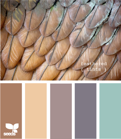
As I see driftwood and reclaimed materials as a form of inspiration, below you can see some images I looked at in order to come up with some possible colours to use:
Categories:
Brief 01,
OUGD503,
Responsive
|
Comments Off
OUGD504 - Design For Print & Web (8) - Recipe App Research
I have decided to mockup an app for Italian recipes, under the Vignelli Brand.
For this reason, I wanted to research into existing recipe apps, finding out what works and what doesn't.
Urban Cook - Rayz Ong
I really like how visual this app is, tiled with imagery. One difficulty I can see with it is it's use on a smart phone - it could be too detailed. However, I could definitely see this app working really well on a tablet.
Mealtime App - Megan Klein
'Mealtime is an app that allows the user to scroll through a field of recipes, add their own recipes, plan their meals, and export a shopping list with ingredients for their meal plan. This app lets you quickly view the essentials about each recipe, save the recipe to 'my recipes' and helps busy people plan their meals and stay healthy.'
Monday, 13 January 2014
Categories:
Design For Print & Web,
OUGD504,
Studio Brief 3
|
Comments Off
OUGD504 - Design For Print & Web (7) - Website Research
www.thecannyman.co.uk
This website uses a simple 2 column grid to allow easy of use. 'Reservations' and ' Opening Times' are always kept on the left column, no matter what page you are on. This is because they are the most vital information. The tone of voice seems to be as formal as my intended website.
Klub Architektů - Petr Kudlacek
Sunday, 12 January 2014
Categories:
Design For Print & Web,
OUGD504,
Studio Brief 3
|
Comments Off


