≈Aesthetic
J
-Illustrative
-Simple
-Clever?
-Clean
-Symmetrical
-Minimal
-Sophisticated
-Crisp
-Textured
-Hand Rendered?
-Organic
-Harmonized
L
-Blurry
-Cluttered
-Random
-Illegible
-Grainy
-Dull
-Cheesy
-Inconsistent
-Confusing
-Cheap
-Weird
- Subjective responses
- Understanding other people’s aesthetic
- Immediate response
- Market research – in front of target
audience.
- The best understanding of aesthetic is
instant.
- Aesthetic rules – monitor how the rules
change, as you progress, as content changes etc..
-What
rules make something aesthetically good? If something doesn’t meet them it
makes them bad.
- Counteract subjectivity with
objectivity.
10 statements that define
a shared aesthetic rule (as a pair):
-Layout with type must be readable.
-Type must anchor the image well.
-Image must relate to the message.
-Colour must be appropriate to its given
context.
-Media must be appropriate.
-Media must be well executed.
-Image must contain clarity of its
context.
-Space should be used to an advantage.
- Must be interesting instantly.
- Timeless and possibly iconic/
contemporary.
------------------------------------------------------
My Top 3:
-Media usage must be both well executed
and appropriate.
-Design should be either timeless or
contemporary.
- Must be interesting instantly.
------------------------------------------------------
Do other peoples
contextual work align with my rules?
Hard to define the
statements, why? :
-
Subjective: -Where you grew up, how we grew up, visual culture you are immersed
into. Taste has been developed by personal experiences.
-A visual language, which is hard to
articulate into words. We work visually and respond visually.
-Eg. Simple. How do you define simple?
Organic: Ingenuity but contrastingly, messy.
- - - - - - - - - - - - - - - - - - - - - - - - - - - - - - - - - - - - - - - - - - - -
-My Aesthetic Rules-Graphic Design-
"Design should be either timeless or contemporary"
1. Westerdals - Signage Design - Marius Holtmon, Mette Landsem and Madeleine Skjelland Eriksen
Westerdals is one of the top communication schools in Norway, and this is the signage design produced for it. I like how this design has been emphasised by it's industrial context.
The type used is simple and informative. In my opinion, this could have been designed recently, or possibly 50 years ago. I think this is mainly due to the usage of just a gothic typeface, which on it's own, can often make it's given context timeless.
------------------------------------------------------
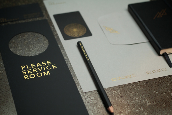
2. The Argonaut Hotel - Identity - Dawson Beggs
I really like the beautiful simplicity of this identity work produced for a high end hotel in San Francisco. The instant feel I got from this work is that it reminded me of something that would be seen in James Bond, due to the class and quality of the aesthetic.
Once again, the use of gothic type has added to the timeless feel, and the choice of stock/ gold ink has added a certain rich quality to the work.
------------------------------------------------------
3. One Degree - Branding - Jason Little & Steve Clarke
The branding for this climate change has been kept incredibly simple. The identity is instantly made obvious though the use of colour.
I think what makes this timeless is the use of body text in an easily communicated and simple way. There is no use of 90's David Carson style editorial design, with paragraphs at obscure angles. The text is only kept horizontal or perpendicular.
- - - - - - - - - - - - - - - - - - - - - - - - - - - - - - - - - - - - - - - - - - - -
"Media usage must be both well executed and appropriate"
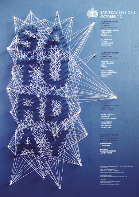
1. Ministry of Sound - Saturday Sessions - D & AD Award Entry - Charlotte Estelle Littlehales
This is the work of Nottingham - based student Charlotte Estelle Littlehales. The reason I have chosen this as an work that is appropriate to it's media is the usage of string to create type. The work is for "Ministry of Sound: and the string used is reminiscent of lights and lasers seen in clubs.
------------------------------------------------------
Techo Music: Norway 2 - Album Artwork Design - Ah Young KIm
------------------------------------------------------
Techo Music: Norway 2 - Album Artwork Design - Ah Young KIm
I think the concept behind this design works beautifully. The genre of music on the CD is techno, which contains clear layers of repetitive music. You can see by the choice of tranparent stock that the different layers of imagery can be seen, replicating the music. The repetition can also be seen.
------------------------------------------------------
Diet Coke Typeface - Sharif Elsabagh
I love the use of Diet Coca Cola as a choice of media. The type appears slightly ominous, and I like the concept of using the media itself to communicate the message entirely.
Diet Coke Typeface - Sharif Elsabagh
I love the use of Diet Coca Cola as a choice of media. The type appears slightly ominous, and I like the concept of using the media itself to communicate the message entirely.
- - - - - - - - - - - - - - - - - - - - - - - - - - - - - - - - - - - - - - - - - - - -
The front cover of this CV stoof out to me instantly. This is obviously fulfilling it's purpose, as CV's are often over - looked and thrown away. It is especially important to have an eye catching CV if you are a designer, as it gives you an opportunity to show off your work.
------------------------------------------------------
DIY Magazine - Peter Ørntoft
The concept behind this magazine is the idea of designing the layout of a magazine yourself. Admitingly, I think the idea is to aid designers with layout, as this seems to be a set template. However, the colour and design itself has brought my eye to it. I like the idea of working OUTSIDE the frame of a typical magazine, and the use of translucent stock gives the product depth and a change from a typical magazine.
------------------------------------------------------
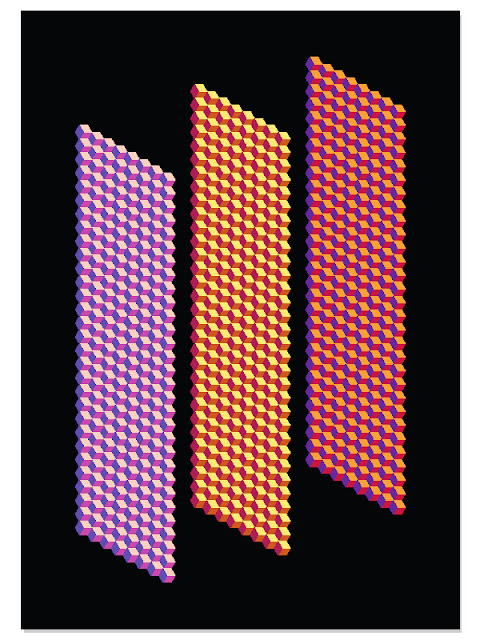
Abstract Posters - Steve Buffoni
What brought my eye to these posters was the sheer detail involved. Although they are sheerly aesthetic, I still find them inspiring. I think the most successful of the 3 is the largest. This is a common optical illusion pattern, which I would like to replicate myself or produce another with different geometric shapes. I also feel inspired by the colour scheme.
Level 4: Studio Task 2 – Aesthetic Judgement
Look at rules that you have identified, and find 3 examples that some up/ fulful rules. (9 Images in total), and summarise why they meet the rule.
5 others examples for each rule that come under other creative practses eg. Photography, illustration, product design
- - - - - - - - - - - - - - - - - - - - - - - - - - - - - - - - - - - - - - - - - - - -
-My Aesthetic Rules-Other Contexts-
The next set of images are of things that fit my rules of aesthetic, out of a graphic design context.
"Design should be either timeless or contemporary"
Industrial Design - Peter Stathis - Link Lamp
------------------------------------------------------
Architecture - Lomas i5 Beach House - Carlos Salcedo & Jorge Haaker
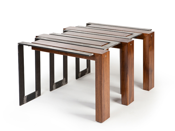
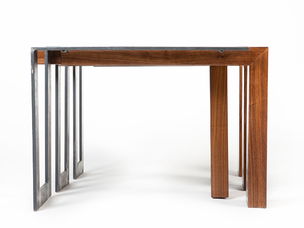
At first glance of Yberg's table, it is easy to understand the name, through the usage of materials. The table was inspired by the designers self reflection of contrasting emotions, shown by the split. The usage of industrial steel and beautiful black walnut with a smooth finish, work in perfect and opposite harmony.
------------------------------------------------------
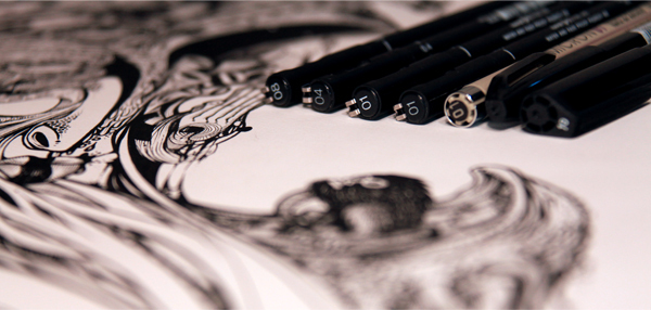
Illustration - INSTINCTIVE - DZO Oliver
This artist definitely produces "well executed" work, appropriate to its' chosen media.
The artist mentions about their work: "This series of drawings are very special. Each piece is made directly to the ink pen without sketch beforehand".
This is the reason I think the artist has perfected his media. He has the confidence and imagination to create beautifully detailed pieces without any correction. You could see this as a disadvantage of the media, but it seems the artist has taken it as a challenge, as oppose to digital drawing which can always be undone or digitally adapted with ease.
------------------------------------------------------
Illustration - Cafe Bonafide - PLENTY
I really like this hand rendered typography created using chalk for a Argentinian restaurant. The use of chalk gives the shape of the letters and furniture much more freedom than many other choices of media.
------------------------------------------------------
- - - - - - - - - - - - - - - - - - - - - - - - - - - - - - - - - - - - - - - - - - - -
-My Aesthetic Rules-Other Contexts-
The next set of images are of things that fit my rules of aesthetic, out of a graphic design context.
"Design should be either timeless or contemporary"
Industrial Design - Peter Stathis - Link Lamp
This lamp by Stathis is beautifully simple. The
balance has been struck between function and form, which is often a sign of
timeless design. Despite looking timeless, the process of production uses
cutting edge technology, and sets a benchmark for "cradle to cradle"
design, taking into consideration future generations and sustainability.
------------------------------------------------------
Industrial Design -Tenor Wireless Speaker - Rafal Caniecki
When researching into the design of this product, the designer has mentioned he was "inspired by Modern architecture. I think this is clear, and in my mind is reminiscent of The Guggenheim in New York. I like how modern technology is used (such as wireless technology) in a context where it isn't made obvious, as in a few years time this could appear dated.
------------------------------------------------------
Industrial Design - Coca Cola - Hobble Skirt Design - 1915 - Clyde Edwards
The hobble skirt glass bottle design is clearly iconic and timeless. Normally something which is timeless seems to be Modernist, but in this case I think it has become timeless due to exposure. I think it's interesting that the development of new technology in drink packaging (such as plastic and aluminium) did not effect the popularity of the original design.
------------------------------------------------------
Industrial Design - Satellite - Joseph Cleghorn
I think what makes this piece of furniture design as timeless is it's deceptive, precise engineering. The dovetail birch worktop seems to float above it's drawers, and the drawers themselves have been left beautifully minimal.
------------------------------------------------------
Architecture - Lomas i5 Beach House - Carlos Salcedo & Jorge Haaker
- - - - - - - - - - - - - - - - - - - - - - - - - - - - - - - - - - - - - - - - - - - -
"Media usage must be both well executed and appropriate"
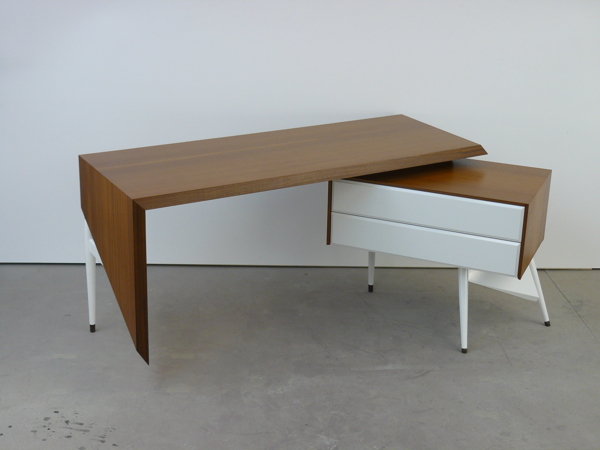
Industrial Design - Table With An Identity Crisis - Axel Yberg
At first glance of Yberg's table, it is easy to understand the name, through the usage of materials. The table was inspired by the designers self reflection of contrasting emotions, shown by the split. The usage of industrial steel and beautiful black walnut with a smooth finish, work in perfect and opposite harmony.
------------------------------------------------------
Illustration - INSTINCTIVE - DZO Oliver
This artist definitely produces "well executed" work, appropriate to its' chosen media.
The artist mentions about their work: "This series of drawings are very special. Each piece is made directly to the ink pen without sketch beforehand".
This is the reason I think the artist has perfected his media. He has the confidence and imagination to create beautifully detailed pieces without any correction. You could see this as a disadvantage of the media, but it seems the artist has taken it as a challenge, as oppose to digital drawing which can always be undone or digitally adapted with ease.
------------------------------------------------------
Illustration - Cafe Bonafide - PLENTY
I really like this hand rendered typography created using chalk for a Argentinian restaurant. The use of chalk gives the shape of the letters and furniture much more freedom than many other choices of media.
------------------------------------------------------
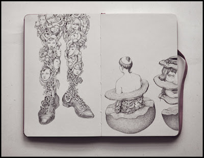
Illustration - Ballpoint Pen Drawings - Anton Vill
Another illustrator who has mastered a simple and everyday medium. Ball point pens are often looked down on for illustrative purposes, as they are cheap and seem only appropriate for doodles. Not only do I think this artist has mastered it's medium in both tone and detail, but also an incredible imagination.
------------------------------------------------------
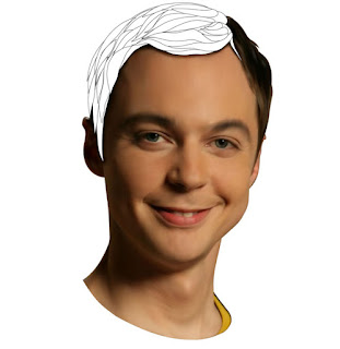
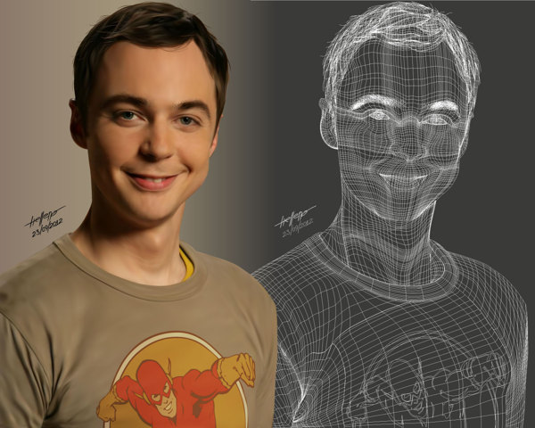
Graphic Art - Sheldon Cooper Gradient Mesh - Helleno Souza
- - - - - - - - - - - - - - - - - - - - - - - - - - - - - - - - - - - - - - - - - - - -
"Must be interesting instantly"
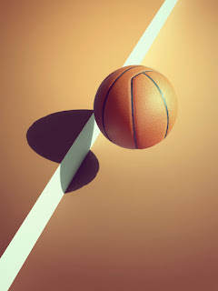
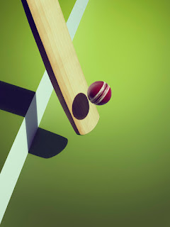
Photography - Sports Shadow - Kelvin Murray (Photographer) / Gemma Fletcher (Art Director)
Three things stood out straight away:
Colour. Each image is beautifully rich.
Lighting. The vignette on each image were perfectly in contrast with the bright light cast over each object.
Surreal imagery. The images themselves are confusing. They are captured as "still life's", yet you would expect them to have lot's of movement. The shadows are also confusing to look at, as they appear to be working on two dimensions, whereas the line hints at one.
------------------------------------------------------
Web Design / Photgraphy - Kinner Italia Fall/ Winter Collection '12 - SuperBruut
Obviously there is a Graphic Design element to this, but that was not what drew me to it. I thought it was a really interesting way to show the interaction of a show with a given environment. Although the environment itself is unrealistic, it adds much more excitement to that of a static image, and also an interactive quality to the website.
------------------------------------------------------
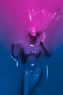
Photography - SKINDEEP - Julien Palast
Once again, colour and dynamics automatically attracted me to this work. I think the rich colour gradients work fantastically with the plastic - like material, and the forms produced in the plastic emphasise the human form well, in conjunction with the lighting.


