The problem in designing Japanese fonts is the sheer quantity of characters – 50,000 compared to 26 for their latin counterpart – and the labor involved. This is why Japanese fonts are so expensive.
Below are a mix of Japan-influenced roman fonts and actual Japanese fonts.
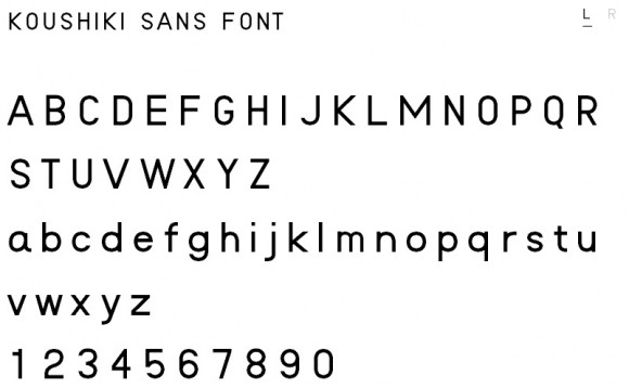
Koushiki Typeface
A solid font that is free and comes with very few restrictions. It was designed by graphic designer Atsushi Kawakami and was just released on Jan 5, 2012. And with an English interface downloading it couldn’t be easier!

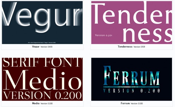
Dot Colon Typefaces
An assortment of fonts by web designer Sora Sagano.
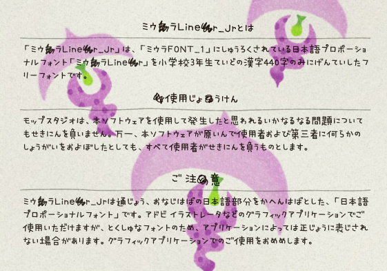
Miura Liner Jr.
A handwriting font. Although the Miura font family is not free, Mop Studio has released a free version called Miura Liner Jr. The font contains over 450 characters in Kanji.
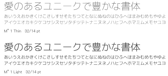
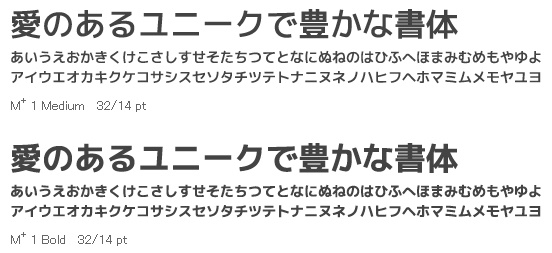
M+ IPA
The M+ fonts are quite beautiful. They’re free and feature proportional and fixed-halfwidth Latin, as well as fixed-fullwidth Japanese. I intend on using this font, as there is an entire font family to work with.
